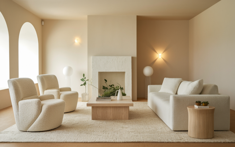
23 White on White Aesthetic Ideas That Feel Luxe
A white on white aesthetic can completely transform how a space feels—turning even the simplest room into something calm, bright, and effortlessly luxurious. Imagine walking into a home that feels airy, peaceful, and perfectly balanced without relying on bold colors or heavy decor. That’s exactly what this style delivers. In this article, you’ll discover beautifully curated ideas that show how layering textures, lighting, and minimal design can create a high-end look with ease.
In my experience, people are often surprised by how powerful small changes can be. I’ve noticed that even switching to softer tones or cleaner layouts instantly makes a room feel more expensive and relaxing. If you’re looking for inspiration that is both practical and visually stunning, this guide will help you rethink your space in the simplest yet most impactful way.
Layered White Bedding
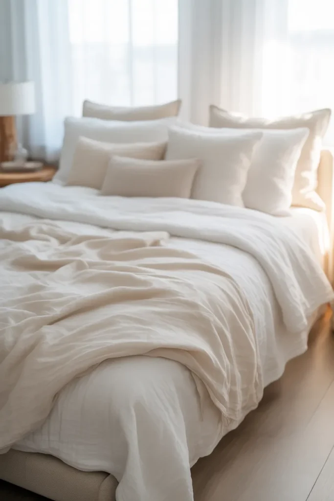
- Creates depth without adding color
- Makes the bed feel plush and inviting
- Easy to refresh with different textures
- Works in both modern and classic spaces
Nothing feels more effortlessly luxurious than a bed layered entirely in soft, tonal whites. The key is mixing textures instead of shades, so the space never feels flat or sterile. Crisp cotton sheets, a slightly wrinkled linen duvet, and a chunky knit throw instantly create dimension. I’ve noticed that even the smallest bedrooms start to feel hotel-like when the bed becomes the visual centerpiece. This approach works beautifully in a white on white aesthetic because it adds richness without breaking the monochrome palette or overwhelming the space with contrast.
What makes this setup truly work in real homes is how forgiving and flexible it is over time. You don’t need perfectly matching pieces, and slight variations actually improve the look. That’s why many designers recommend layering different fabrics rather than buying a single bedding set. The result is a soft, inviting atmosphere that feels both styled and lived-in. It transforms an ordinary bed into a calming retreat where everything looks intentional, yet relaxed enough to feel comfortable every single day.
Sheer Curtain Glow
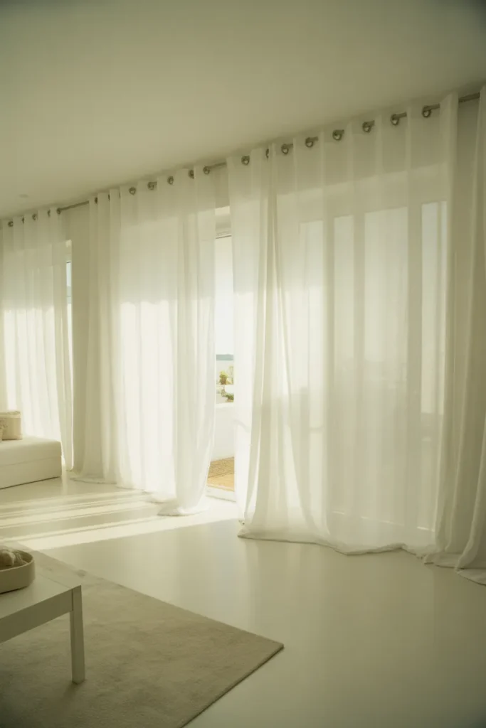
- Softens harsh natural light
- Adds movement and elegance
- Makes the room feel airy and open
- Enhances brightness without glare
Light has a powerful way of shaping how a space feels, and sheer curtains take full advantage of that effect. Instead of blocking sunlight, they diffuse it gently, creating a soft glow that fills the room. I’ve seen this work especially well in smaller spaces where heavy curtains can feel overwhelming. The flowing fabric adds subtle movement, which brings life into an otherwise minimal setup. In a white on white aesthetic, this glow becomes even more noticeable, making the entire room feel calm, bright, and effortlessly refined.
Beyond just looks, sheer curtains improve how the space functions throughout the day. They reduce harsh shadows and glare while still allowing natural light to flow in freely. That balance makes the room feel more comfortable and visually pleasing from morning to evening. In my experience, even a simple window setup can feel elevated just by switching to lighter fabrics. It creates a soft, dreamy atmosphere that feels intentional without requiring expensive decor or complicated design changes.
Textured White Walls
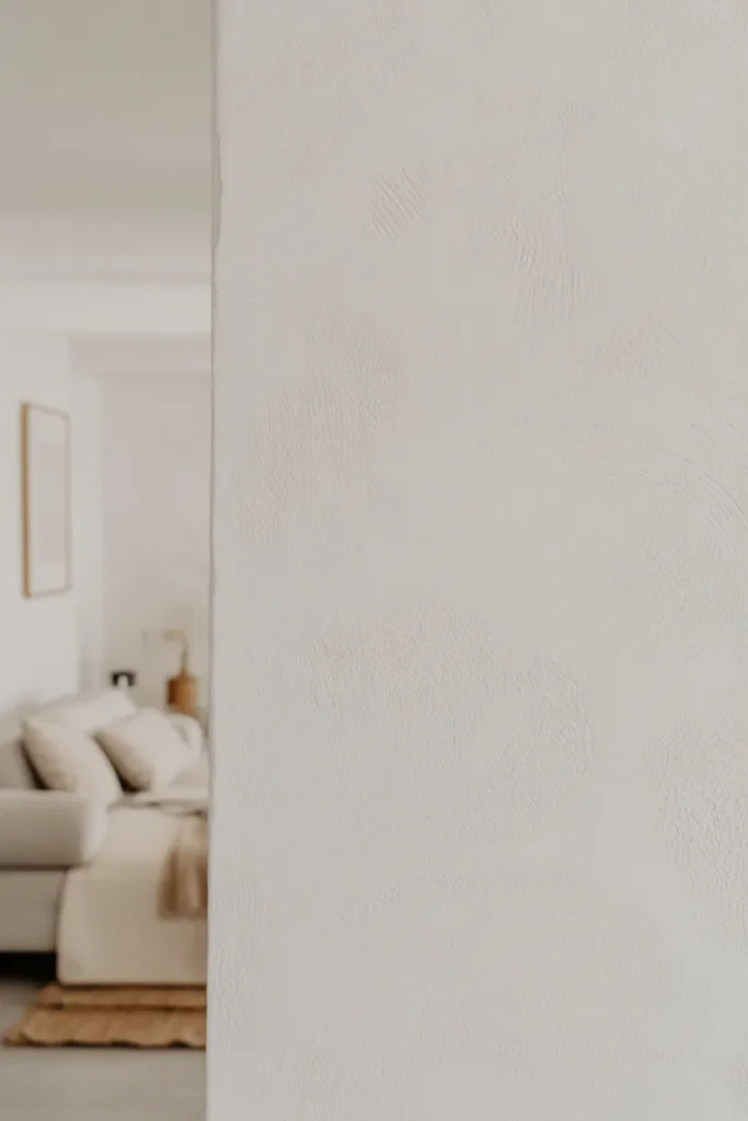
- Adds depth without changing color
- Prevents walls from looking flat
- Works with minimal decor styles
- Creates subtle visual interest
Flat white paint can sometimes feel a little lifeless, but adding texture completely changes the experience. Whether it’s limewash, plaster, or a subtle brushed finish, textured walls create movement and depth without introducing new colors. I’ve noticed that even a plain room starts to feel more thoughtfully designed when the walls have this kind of detail. It’s one of the easiest ways to elevate a minimalist space while staying true to a soft, neutral palette that feels calm and cohesive.
This idea works especially well because it doesn’t rely on extra decor to make an impact. The walls themselves become part of the design, reducing the need for clutter or heavy styling. That’s why many modern interiors use texture instead of bold accents. It keeps the space clean while still feeling visually rich. Over time, this subtle variation continues to feel interesting, making the room look more layered and complete without ever feeling overwhelming or busy.
White Linen Curtains
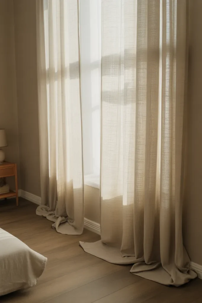
- Adds softness and vertical height
- Makes ceilings feel taller
- Creates a relaxed, lived-in look
- Filters light beautifully without heaviness
There’s something effortlessly elegant about long white linen curtains that slightly touch the floor. They instantly draw the eye upward, making ceilings appear taller and the entire room feel more spacious. I’ve noticed that even basic rooms start to feel styled when curtains are hung higher than the window frame. The natural texture of linen prevents the space from feeling too polished or stiff, which keeps the overall look balanced. This approach works beautifully when you want a calm, airy environment without introducing bold design elements.
What makes linen curtains especially practical is how they age over time. The slight wrinkles and soft folds actually enhance the look instead of ruining it. That’s why many designers prefer linen over perfectly crisp fabrics. It brings a relaxed elegance that feels natural and welcoming. In everyday living, this means less maintenance and more visual comfort. The result is a space that feels thoughtfully designed but still easy to live in, which is exactly what makes minimalist interiors feel truly inviting.
Minimal White Shelving
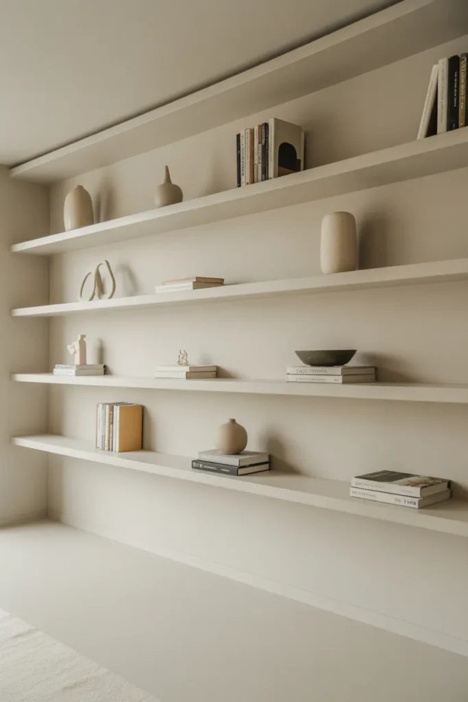
- Keeps the space organized and clean
- Adds function without visual clutter
- Highlights small decor pieces
- Maintains a minimalist look
Clean, floating shelves in a matching tone can quietly transform how a room feels without drawing too much attention. Instead of bulky furniture, these shelves keep everything light and visually open. I’ve seen this work well in both bedrooms and living areas where storage is needed but space is limited. The key is to style them sparingly, allowing each item to stand out without crowding the surface. This approach keeps the room feeling intentional while still being practical for everyday use.
What makes this idea effective is its balance between function and simplicity. You get extra storage without interrupting the visual flow of the room. That’s why many modern interiors rely on open shelving instead of heavy cabinets. In my experience, limiting the number of items on each shelf makes a huge difference in maintaining that clean look. Over time, this setup encourages you to stay organized while keeping the space calm, uncluttered, and visually appealing.
Soft White Rugs
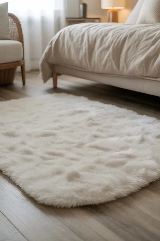
- Adds warmth to bright spaces
- Softens hard flooring surfaces
- Enhances comfort underfoot
- Defines the space subtly
A soft white rug has the power to ground a space while still keeping everything light and cohesive. It introduces warmth without disrupting the neutral palette, which is essential for maintaining a clean and calming environment. I’ve noticed that rooms with hard flooring instantly feel more inviting when a plush rug is added. It creates a sense of comfort that you can both see and feel, making the space more livable while still looking styled and intentional.
Beyond comfort, rugs also help define different areas within a room, especially in open layouts. That subtle separation makes the space feel more organized without adding physical barriers. In my experience, choosing a slightly textured or layered rug prevents it from looking too flat or sterile. This small detail makes a big visual difference over time. The result is a cozy, balanced space that feels complete without needing additional colors or heavy decorative elements.
Also View : 21 Living Room Color Schemes That Feel Fresh & Chic
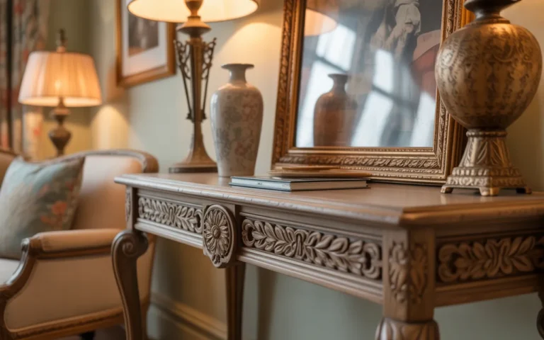
White Ceramic Decor
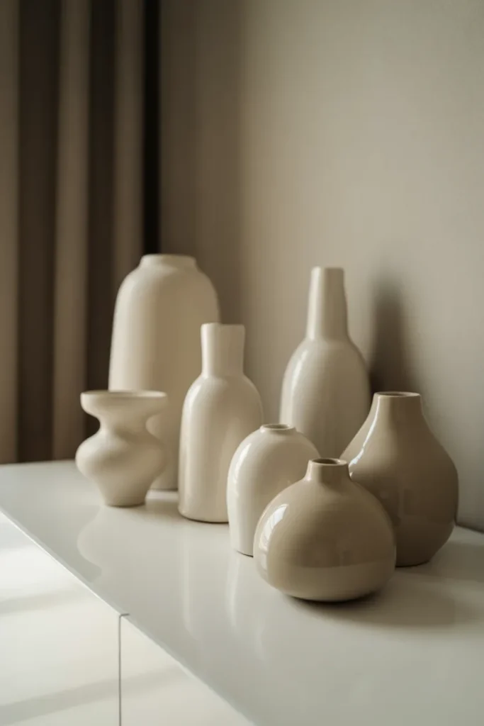
- Adds subtle contrast through shapes and finishes
- Keeps styling cohesive and uncluttered
- Works well on shelves, tables, and consoles
- Easy to swap or rearrange over time
Small ceramic pieces can quietly elevate a space when everything stays within the same tonal range. Instead of relying on color, the focus shifts to form, finish, and spacing. Matte vases paired with slightly glossy pieces create just enough contrast to feel interesting. I’ve noticed that even a simple console looks styled when a few well-chosen objects are grouped together. This approach fits perfectly within a white on white aesthetic because it builds visual depth while keeping the palette calm and consistent.
What makes this idea practical is how flexible it is for everyday styling. You can move pieces around, remove items, or add new ones without disrupting the overall look. That’s why many designers recommend sticking to a single color family for decor accents. It simplifies decision-making while still allowing creativity. In my experience, leaving a bit of empty space between objects makes everything feel more intentional. The result is a clean, curated setup that feels balanced, modern, and easy to maintain.
Monochrome Wall Art
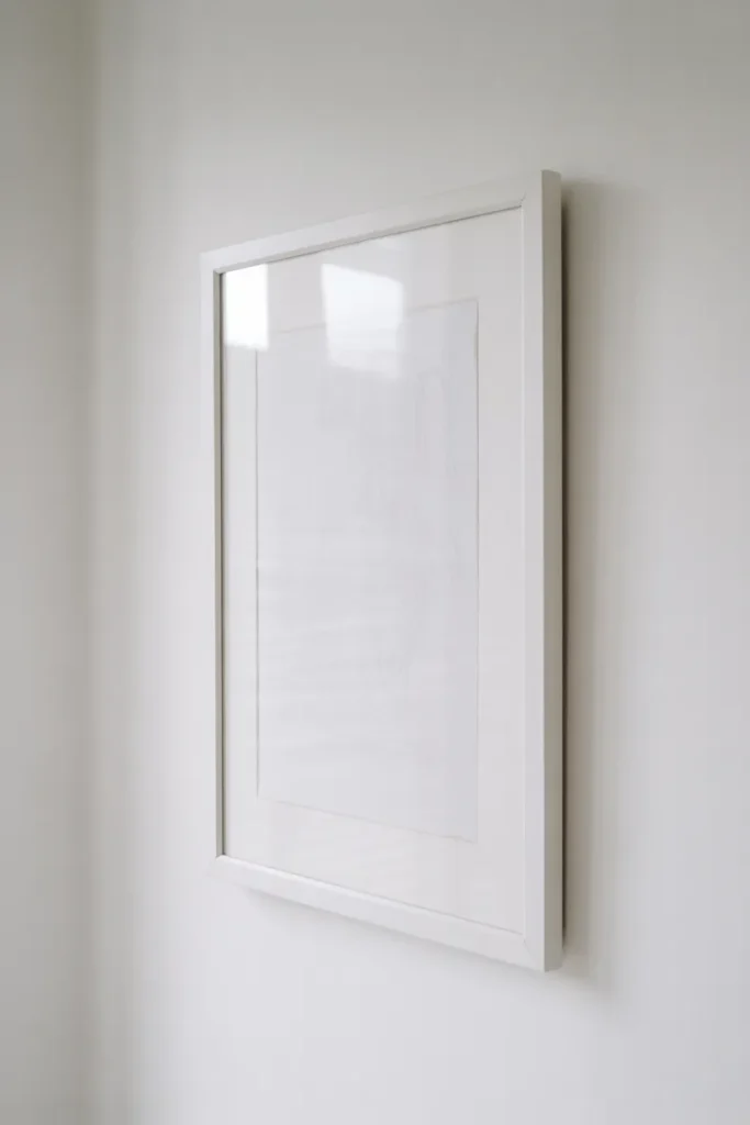
- Adds visual interest without heavy contrast
- Keeps walls from feeling empty
- Maintains a clean and cohesive look
- Easy to mix with different styles
Artwork doesn’t have to be bold to make an impact, especially in a soft neutral space. Monochrome wall art blends seamlessly into the room while still adding personality and detail. Thin lines, abstract shapes, or minimal sketches create a quiet focal point that doesn’t overwhelm the space. I’ve seen this work particularly well in bedrooms where a calm atmosphere matters most. It allows the walls to feel styled while still keeping everything light and balanced.
The beauty of this approach is how adaptable it is over time. You can swap frames, adjust placements, or even rotate artwork without disrupting the overall design. That’s why many interiors rely on subtle art instead of statement pieces in minimal setups. In my experience, keeping frames light or matching them with the wall color enhances the seamless effect. This creates a gallery-like feel that looks refined, cohesive, and thoughtfully designed without trying too hard.
White Upholstered Bed
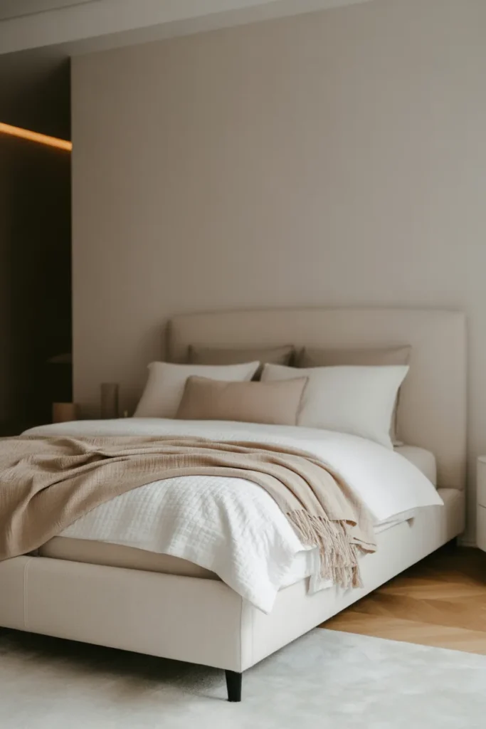
- Creates a soft and inviting focal point
- Adds comfort and texture to the room
- Works with multiple interior styles
- Enhances the cozy factor instantly
A fully upholstered bed in a soft white fabric instantly becomes the centerpiece of any bedroom. It brings warmth and comfort that plain frames often lack, especially in minimalist spaces. The padded headboard adds both function and style, making the bed feel more inviting for everyday use. I’ve noticed that even simple bedding looks more elevated when paired with an upholstered frame. It creates a layered, cozy look that feels intentional without needing extra decoration.
What makes this choice especially practical is how versatile it is across different design styles. Whether the room leans modern or slightly classic, this type of bed adapts easily. That’s why many designers consider it a safe yet impactful investment. In my experience, choosing a slightly textured fabric helps prevent the look from feeling too flat. Over time, it continues to add softness and depth, making the entire bedroom feel more comfortable, balanced, and visually complete.
White Floating Nightstands
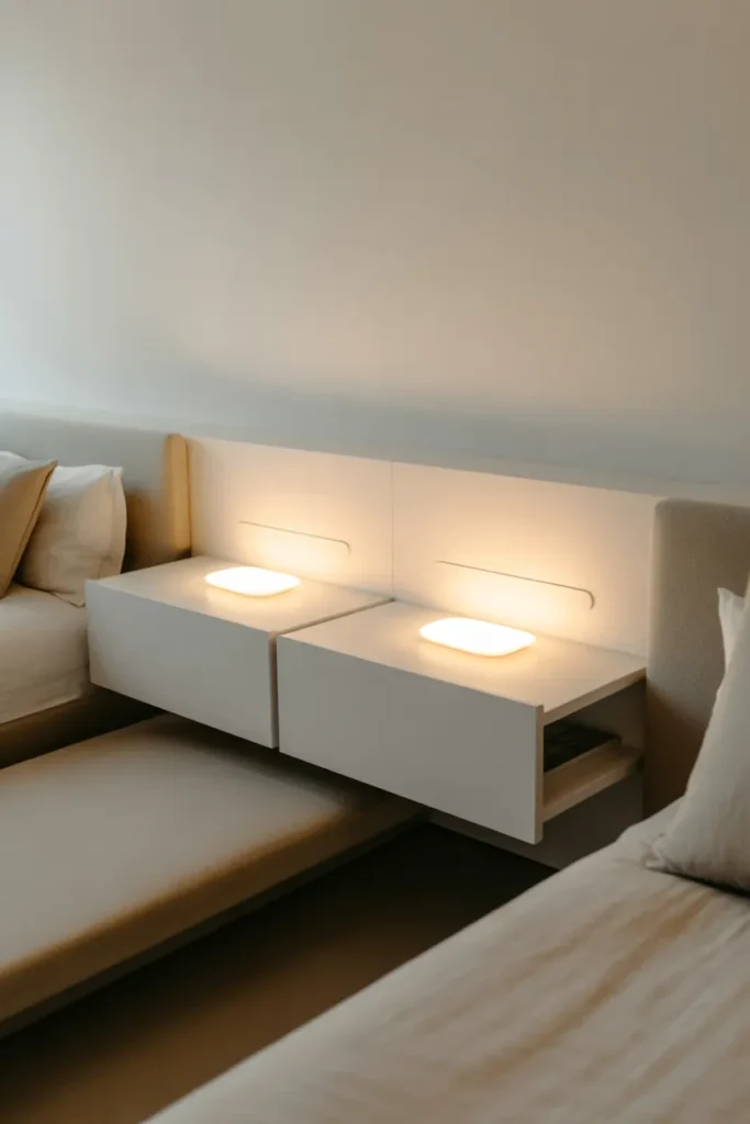
- Saves floor space and keeps layout open
- Creates a clean, modern bedside look
- Easy to keep clutter-free
- Enhances visual balance in small rooms
Floating nightstands instantly make a bedroom feel lighter and more spacious by freeing up floor space. Instead of bulky furniture, these sleek units blend into the wall and keep the focus on the bed. I’ve noticed that rooms feel noticeably less crowded when traditional nightstands are replaced with wall-mounted options. This setup also makes cleaning easier, which is a small but meaningful benefit in daily life. It’s a simple upgrade that delivers both visual clarity and practical convenience without requiring a full room redesign.
What makes this idea effective is how it encourages minimal styling. With limited surface space, you naturally keep only the essentials, which helps maintain a calm and uncluttered environment. That’s why many designers prefer floating pieces in modern interiors. In my experience, pairing them with soft lighting creates a balanced and cozy atmosphere without adding visual weight. Over time, this approach keeps the room feeling organized, functional, and effortlessly refined.
All White Workspace
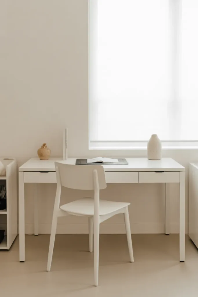
- Boosts focus with a clean environment
- Makes small work areas feel larger
- Reduces visual distractions
- Easy to style and maintain
A workspace designed entirely in soft white tones creates a calm and distraction-free environment that naturally improves focus. Without competing colors or clutter, your attention stays on the task in front of you. I’ve noticed that even short work sessions feel more productive in a clean, minimal setup like this. The simplicity helps reduce mental fatigue, making it easier to stay consistent with daily routines. It’s a subtle but powerful way to improve how a space supports your workflow.
What makes this idea practical is how easy it is to maintain over time. With fewer items on display, cleaning and organizing become much simpler. That’s why many people shift toward minimal desk setups after experiencing cluttered workspaces. In my experience, adding just one or two soft-textured elements keeps the area from feeling too sterile. This balance creates a workspace that feels both functional and visually calming, making it easier to stay productive throughout the day.
White Panel Wall
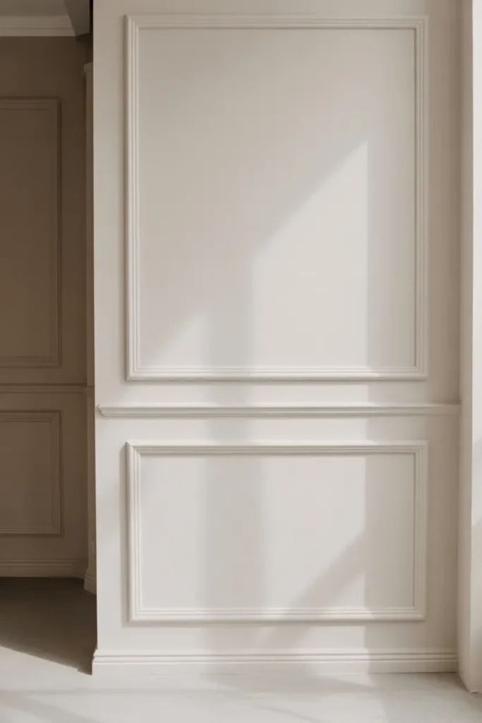
- Adds architectural detail without color
- Makes walls feel more refined
- Works in both modern and classic spaces
- Elevates the entire room subtly
A paneled wall in a soft white tone adds instant character without introducing bold design elements. The subtle lines and structure create depth, making the wall feel more refined and intentional. I’ve seen this transform plain rooms into more polished spaces without needing additional decor. The detailing catches light throughout the day, adding gentle shadows that enhance the overall look. It’s a timeless approach that works beautifully in spaces where simplicity is key.
What makes this idea especially valuable is its long-term impact. Unlike trend-based decor, paneling remains visually appealing for years without feeling outdated. That’s why many designers use it as a foundation for minimalist interiors. In my experience, even a single feature wall can elevate the entire room. It creates a balanced backdrop that supports other design elements while still standing out in a subtle, elegant way.
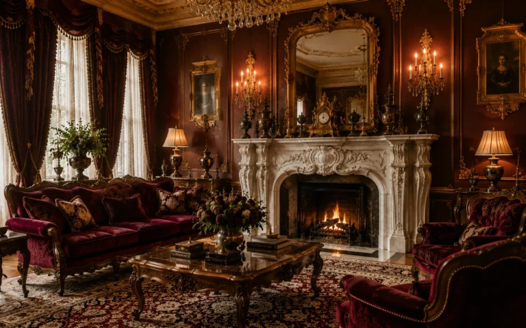
White Marble Accents
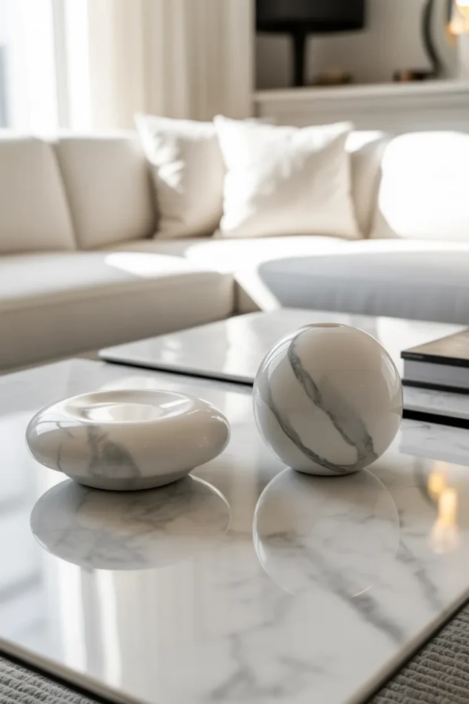
- Adds a touch of natural luxury
- Introduces subtle pattern without color
- Reflects light for a brighter feel
- Works in both small and large spaces
Marble has a way of making any space feel instantly refined without overpowering the overall design. The soft veining adds just enough variation to break up flat surfaces while still keeping everything cohesive. I’ve noticed that even a small marble tray or table can elevate the entire room visually. It reflects light beautifully, which enhances brightness and makes the space feel more open. This makes it a perfect addition when you want a clean look that still feels rich and thoughtfully designed.
What makes marble accents especially practical is their versatility across different areas of the home. From living rooms to bedrooms, they blend seamlessly without requiring major changes. That’s why many designers use marble sparingly to create focal points without clutter. In my experience, combining polished marble with softer textures like fabric or wood keeps the balance just right. Over time, this mix creates a space that feels both luxurious and comfortable without becoming overly formal.
White Open Wardrobe
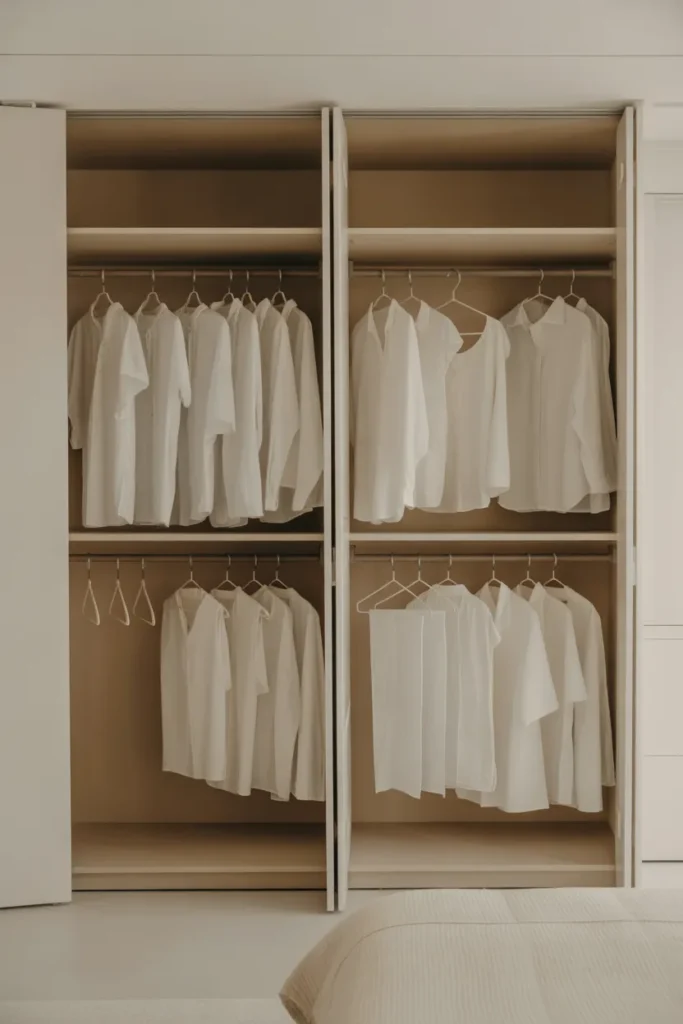
- Keeps clothing visually organized
- Makes the room feel more open
- Encourages minimal wardrobe habits
- Doubles as a design feature
An open wardrobe in a clean white setup turns everyday storage into part of the room’s design. Instead of hiding everything behind doors, it creates a light and airy feel that blends seamlessly with the rest of the space. I’ve noticed that this setup naturally encourages better organization because everything is visible. When done right, it doesn’t feel cluttered but rather curated and intentional, making the room feel more spacious and thoughtfully arranged.
What makes this idea work in real homes is the discipline it gently creates over time. You become more mindful of what you keep and how you arrange it. That’s why many minimalist interiors favor open storage solutions. In my experience, sticking to a consistent color palette for clothing helps maintain that clean look. This approach transforms storage into a visual element that supports the overall aesthetic while still being practical for daily use.
White Layered Lighting
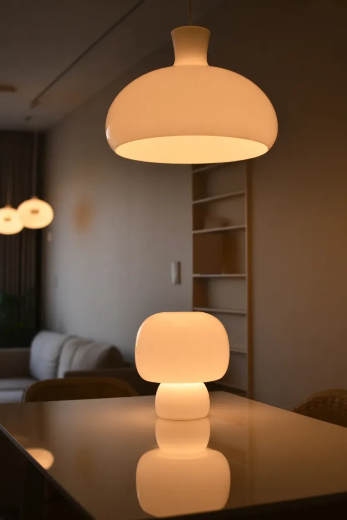
- Creates depth through different light sources
- Enhances mood and atmosphere
- Prevents the space from feeling flat
- Works day and night
Lighting plays a huge role in how a space feels, especially when everything follows a soft neutral palette. Layering different light sources adds depth and prevents the room from looking flat or overly bright. A mix of ambient, task, and accent lighting creates a balanced environment that feels both functional and inviting. I’ve noticed that even simple rooms look more refined when lighting is thoughtfully arranged. It highlights textures and surfaces in a subtle way that enhances the overall design.
What makes layered lighting effective is its flexibility throughout the day. You can adjust the mood depending on the time or activity, which makes the space more livable. That’s why many designers focus on lighting as a key part of interior styling. In my experience, using warm tones instead of harsh white light creates a softer and more comfortable atmosphere. This small adjustment can completely change how the space feels, making it more welcoming and visually complete.
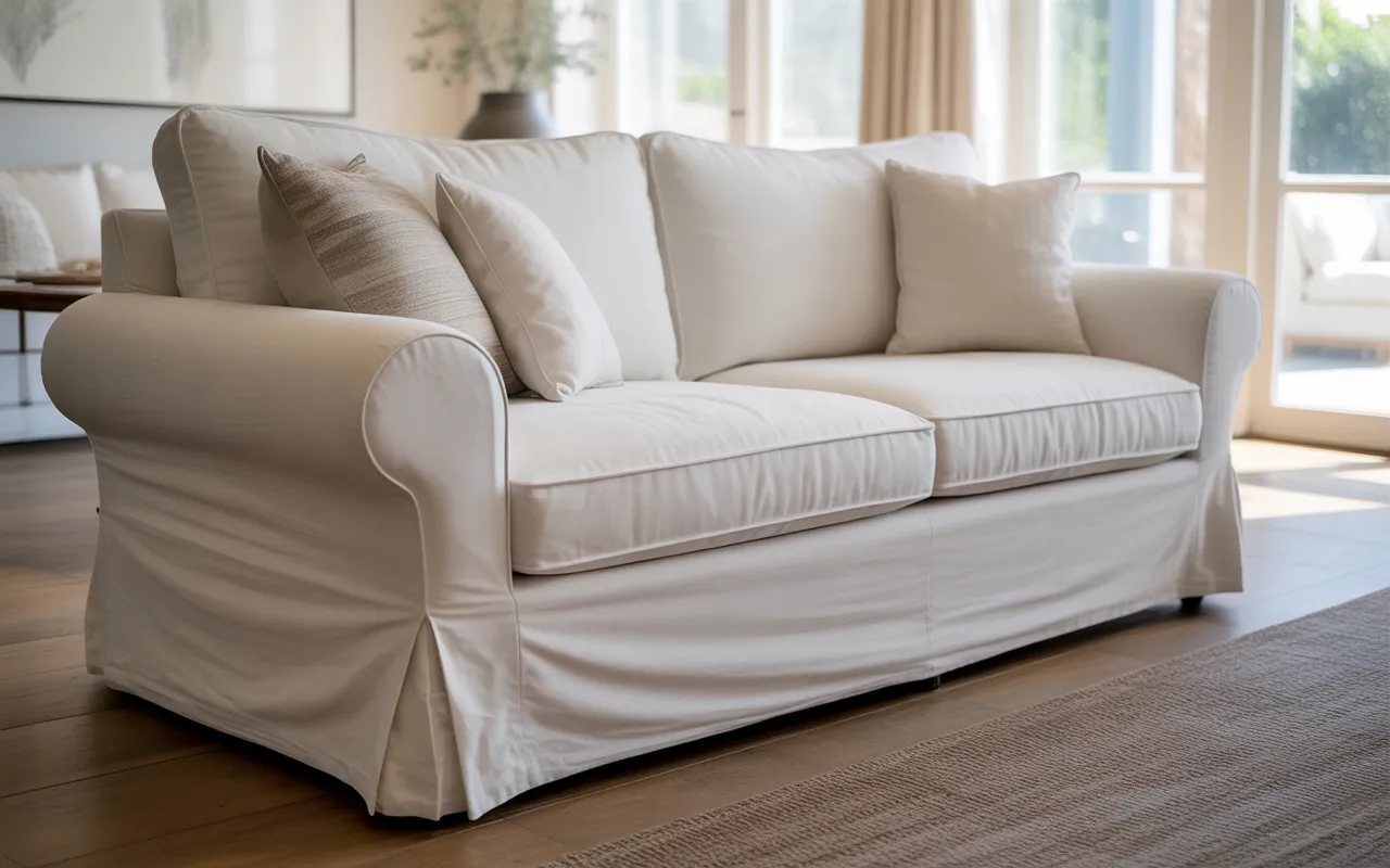
White Slipcovered Sofa
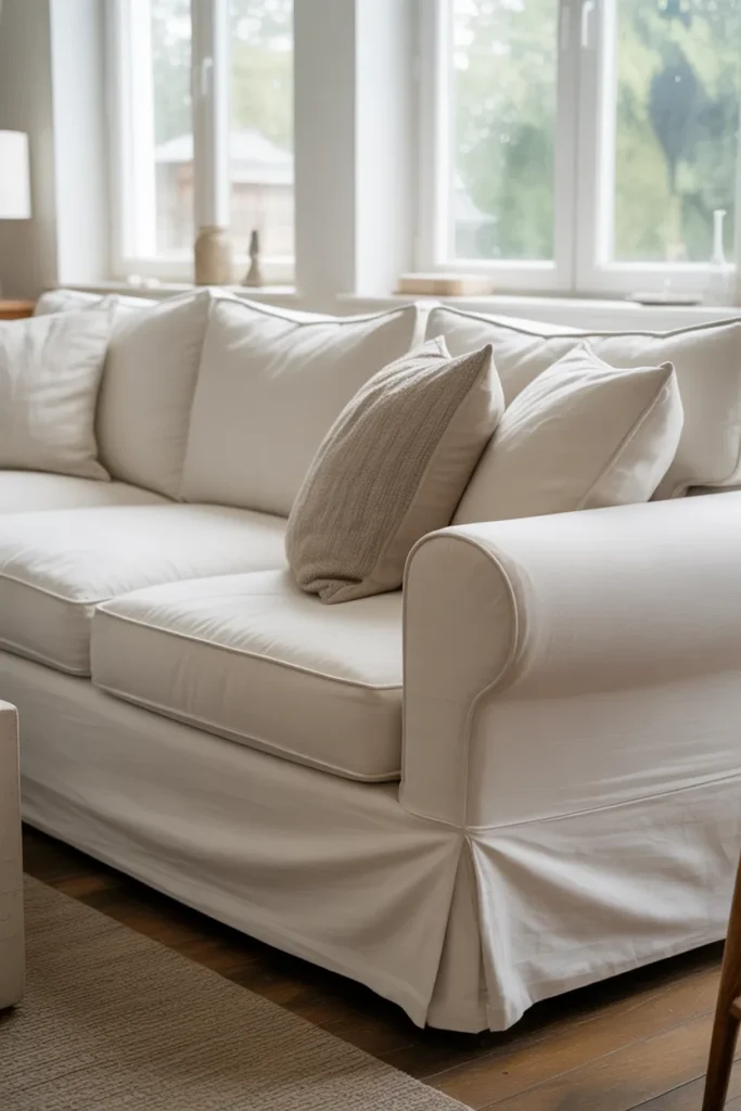
- Creates a relaxed yet refined look
- Easy to clean and maintain
- Adds softness to structured spaces
- Works in both casual and modern homes
A slipcovered sofa in a soft white tone brings a perfect balance between comfort and understated elegance. The slightly loose fit and natural wrinkles give it a relaxed feel that doesn’t look overly styled or rigid. I’ve noticed that this type of seating instantly makes a room feel more welcoming, especially in everyday living spaces. It softens the overall look while still keeping everything cohesive and light. This approach works beautifully when you want a space that feels lived-in without sacrificing a clean and intentional design.
What makes this idea especially practical is how forgiving it is in real life. Slipcovers can be removed and washed, which makes them ideal for homes that see daily use. That’s why many designers recommend them for families or high-traffic areas. In my experience, choosing a durable fabric helps maintain the look over time without constant upkeep. This setup creates a comfortable environment that still feels polished, making it easier to enjoy the space without worrying about perfection.
White Minimal Entryway
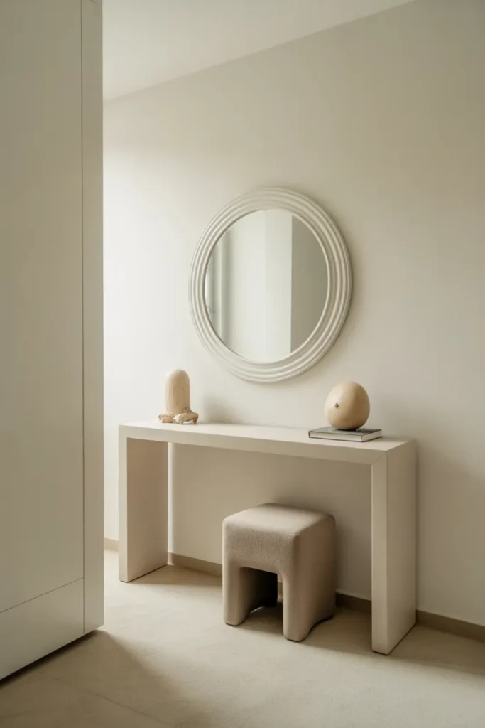
- Makes a strong first impression
- Keeps the space clean and organized
- Reflects light in smaller entry areas
- Easy to maintain daily
An all-white entryway sets the tone for the entire home the moment you walk in. It feels fresh, open, and instantly calming, even in smaller spaces. A slim console paired with a simple mirror creates just enough function without overcrowding the area. I’ve noticed that keeping entryways minimal makes daily routines smoother, especially when you’re coming and going frequently. The brightness also helps the space feel larger than it actually is, which is a big advantage in compact layouts.
What makes this idea work so well is its simplicity. With fewer items, it becomes easier to maintain order and avoid clutter buildup. That’s why many designers keep entryways intentionally minimal. In my experience, adding one or two subtle decor pieces is enough to make the space feel complete without overwhelming it. Over time, this setup creates a welcoming and organized environment that feels consistent with the rest of a clean, modern home.
White Ceiling Beams
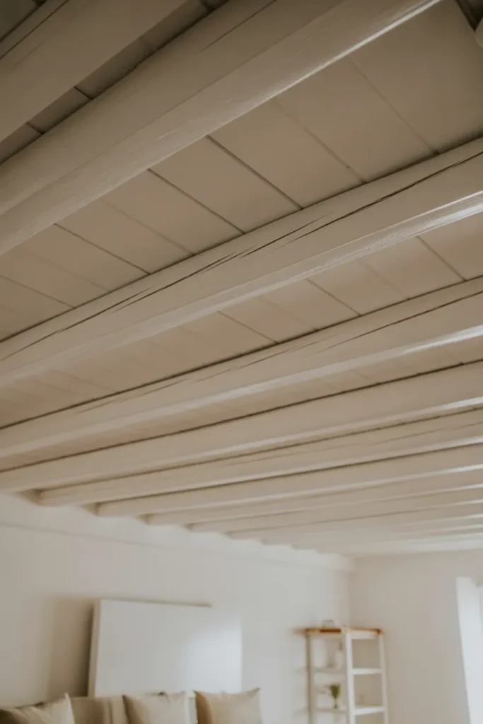
- Adds architectural interest overhead
- Creates depth without dark tones
- Enhances spacious feel
- Works in both modern and rustic styles
Ceiling beams painted in soft white tones add subtle structure without making the space feel heavy. Instead of drawing attention away, they blend into the room while still creating depth and dimension. I’ve seen this work beautifully in open spaces where the ceiling can otherwise feel plain or overlooked. The light color keeps everything cohesive while the structure adds just enough detail to make the room feel more complete. It’s a quiet upgrade that makes a noticeable difference over time.
What makes this idea especially effective is how it enhances the sense of space. The beams guide the eye across the room, making ceilings feel higher and more expansive. That’s why many designers incorporate architectural details even in minimalist interiors. In my experience, keeping the beams in the same tone as the ceiling maintains a clean and seamless look. This approach adds character without interrupting the calm, balanced feel of the overall design.
White Acrylic Furniture
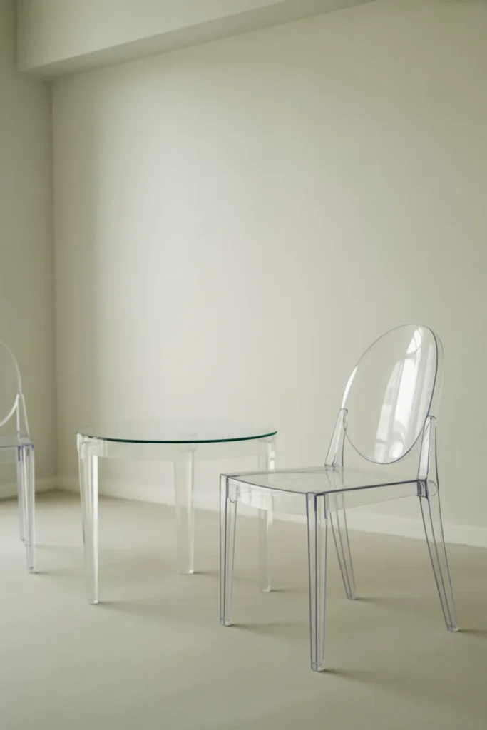
- Creates a barely-there visual effect
- Keeps small spaces feeling open
- Reflects light without adding weight
- Blends easily with any decor style
Acrylic furniture is one of those design choices that almost disappears visually, which is exactly why it works so well in a bright, minimal space. The transparent structure keeps the room feeling open while still providing full functionality. I’ve noticed that even in compact bedrooms or living areas, acrylic pieces prevent the space from feeling crowded. They reflect light in a soft way, helping the overall atmosphere stay airy and clean without interrupting the flow of a white on white aesthetic.
What makes this idea especially useful is how adaptable it is across different layouts. Whether used as a chair, side table, or accent piece, it blends effortlessly into any setting. That’s why many designers use acrylic when they want function without visual heaviness. In my experience, pairing it with soft textiles or warm lighting prevents it from feeling too cold. This balance creates a modern, uncluttered environment that feels both practical and visually light.
White Bedroom Canopy
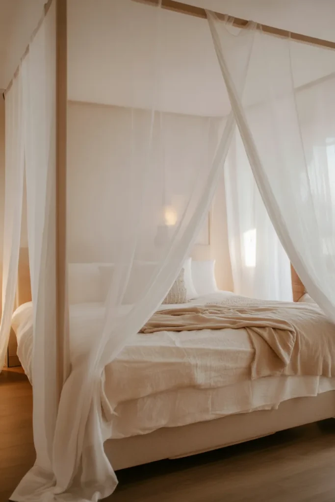
- Adds softness and visual height
- Creates a cozy, dreamy atmosphere
- Enhances bed as a focal point
- Works well in minimalist bedrooms
A white canopy instantly transforms a simple bed into a soft, dreamy focal point. The flowing fabric adds vertical movement, making the ceiling feel higher and the room more open. I’ve noticed that even basic bedding feels more luxurious when framed by sheer drapes. It creates a gentle enclosure without making the space feel closed off, which is ideal for maintaining a light and airy atmosphere. This works especially well in bedrooms where calmness and comfort are the main priorities.
What makes this idea so effective is its ability to change the mood of a room without structural changes. You don’t need renovations—just fabric and placement. That’s why many designers use canopies to create visual impact in simple spaces. In my experience, keeping the fabric light and slightly transparent maintains the balance between elegance and openness. The result is a soothing environment that feels both romantic and minimal at the same time.
White Kitchen Minimalism
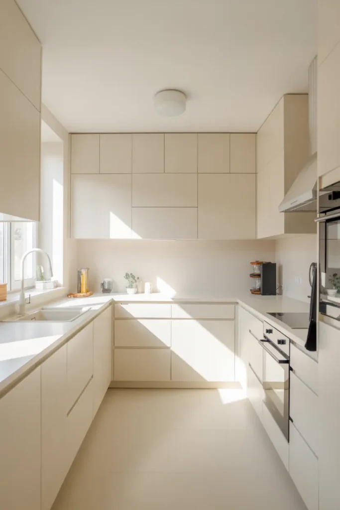
- Creates a clean and timeless look
- Makes kitchen feel larger and brighter
- Reduces visual clutter instantly
- Easy to pair with subtle accents
A fully white kitchen creates an immediate sense of cleanliness and order. The smooth surfaces and uninterrupted lines make the space feel larger and more open, even in smaller layouts. I’ve noticed that when everything blends into a single tone, the kitchen feels less chaotic and more calming to use. It also reflects natural light beautifully, which enhances brightness throughout the day. This makes cooking spaces feel more inviting and less overwhelming.
What makes this idea practical is how easy it is to maintain a consistent look over time. Without strong colors or patterns competing for attention, the space stays visually balanced. That’s why many modern homes lean toward minimal kitchen designs. In my experience, adding subtle texture through stone or matte finishes prevents the space from feeling too flat. The result is a functional yet elegant kitchen that feels organized, modern, and effortlessly clean.
White Floor Lamps
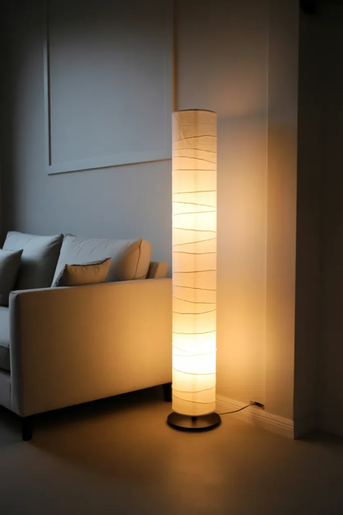
- Adds vertical design element
- Creates soft ambient lighting
- Enhances cozy evening mood
- Blends seamlessly with minimal decor
A white floor lamp is more than just lighting—it becomes part of the room’s structure. Its tall, slim form draws the eye upward, subtly enhancing the sense of height in a space. I’ve noticed that in minimalist interiors, this kind of vertical element helps balance out low furniture like sofas or beds. The soft white finish keeps it visually light, so it doesn’t interrupt the calm atmosphere. At night, the warm glow it produces adds a gentle layer of comfort without overpowering the room.
What makes this idea so effective is how easily it shifts the mood of a space. During the day, it blends quietly into the background, but in the evening it becomes a key source of warmth and ambiance. That’s why many designers rely on floor lamps for layered lighting setups. In my experience, placing one near a seating area instantly makes the space feel more inviting. It creates a soft, lived-in glow that enhances relaxation without adding visual clutter.
White Floating TV Wall
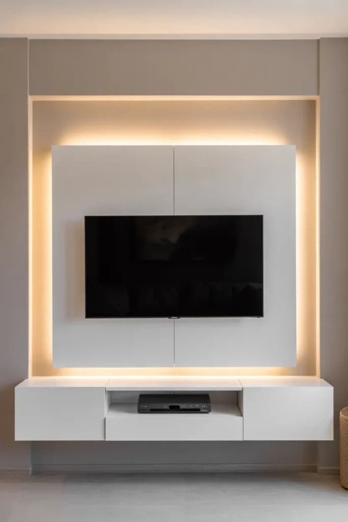
- Hides clutter and cables completely
- Creates a clean entertainment area
- Saves floor space effectively
- Enhances modern minimalist style
A floating TV wall in a white finish transforms a media area into a seamless part of the room. Instead of bulky cabinets and visible wires, everything feels integrated and clean. I’ve noticed that this setup instantly makes living rooms look more organized and high-end. The floating design keeps the floor open, which adds to the sense of space. When paired with soft backlighting, it creates a subtle glow that enhances the overall atmosphere without drawing too much attention to the screen.
What makes this idea so practical is its ability to reduce visual noise. Everything has its place, yet nothing feels heavy or distracting. That’s why many modern homes prioritize wall-mounted systems. In my experience, keeping accessories minimal around the TV area makes a big difference in maintaining balance. This approach creates a sleek, functional focal point that blends technology with a calm, cohesive interior style.
Conclusion :
The beauty of a white on white aesthetic is how effortlessly it turns ordinary spaces into calm, elevated, and timeless interiors. With the right balance of texture, lighting, and minimal design, every room can feel brighter, more spacious, and more luxurious without complicated changes.
If these ideas inspired you, start with just one small update and notice the transformation it brings. I’ve seen how simple shifts like these can completely change the mood of a home. Save this guide on Pinterest so you can revisit it anytime, try your favorite ideas, and share it with others who love clean, beautiful spaces.