21 Living Room Color Schemes That Feel Fresh & Chic
Looking to refresh your living space with style and personality? These 21 living room color schemes offer practical inspiration for creating a fresh, chic, and inviting atmosphere. From calming neutrals and cozy earth tones to bold contrasts and pastel harmonies, each idea shows how color can completely transform a room. I’ve noticed that even small changes, like swapping cushions or adding a statement accent wall, can breathe new life into your space. This guide highlights both timeless palettes and playful combinations, helping you envision how your living room can feel brighter, more balanced, and uniquely yours.
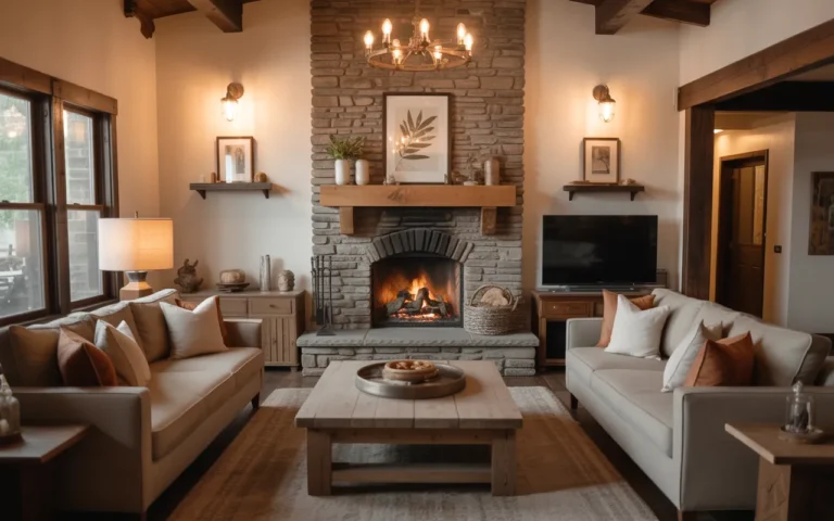
Bold Neutral Layers
- Adds warmth without overwhelming color
- Enhances texture and depth in neutral tones
- Works well with natural light and simple furniture
- Ideal for creating a relaxed, versatile space
- Easy to refresh with small accent pieces
Neutral layers create a timeless, versatile look that feels both fresh and inviting. By mixing soft beiges, taupes, and creams across walls, furniture, and textiles, the room gains depth without heavy contrast. I’ve noticed that layering neutral textures—like a wool rug, linen throws, and velvet pillows—immediately elevates a living space. This technique allows homeowners to update accent colors seasonally or with small accessories, keeping the room dynamic while maintaining a cohesive foundation. The result is a serene, chic backdrop that supports various décor styles effortlessly, perfect for everyday living.
Incorporating bold neutral layers works especially well in rooms with natural light. Soft walls paired with layered furniture textures prevent the space from feeling flat or stark. Many designers recommend adding subtle patterns or mixed materials, such as woven baskets, glass accents, or wooden furniture, to introduce dimension. I’ve seen this approach transform standard living rooms into visually appealing spaces that feel both calming and elevated. By keeping the palette neutral but varied in texture and shade, the room maintains flexibility for furniture placement, accent colors, and seasonal décor updates without requiring a full redesign.
Coastal Blue Vibes
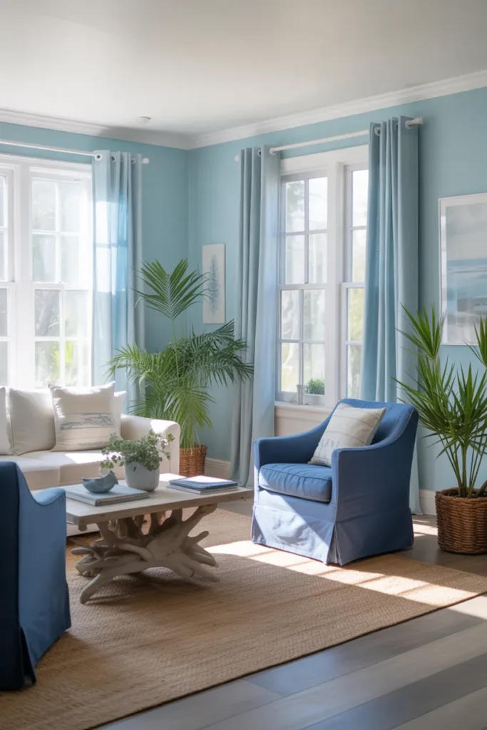
- Brings calm, ocean-inspired ambiance
- Pairs well with natural wood and white accents
- Brightens space with airy, fresh tones
- Creates a relaxing, coastal feel
- Perfect for sunlit rooms with lots of windows
Coastal blue vibes offer a refreshing way to breathe life into a living room without overwhelming the senses. Soft sky blues combined with crisp whites create an airy, open atmosphere reminiscent of seaside retreats. I’ve noticed that incorporating natural textures like driftwood tables, jute rugs, and linen curtains enhances this relaxed aesthetic while keeping it sophisticated. Accent furniture in navy or muted teal adds depth and contrast without disrupting the serene palette. This approach instantly transforms ordinary spaces into calming, stylish rooms where the color feels both intentional and effortlessly chic, inviting relaxation.
Using coastal blues effectively balances color and light, making a room feel expansive and bright. Sunlight enhances the soft blue walls while neutral accents prevent the palette from feeling cold. Many designers recommend layering subtle blues with natural textures and greenery for a lived-in yet polished look. I’ve seen this combination work in small and large living rooms alike, creating a sense of openness and tranquility. Coastal blue accents provide a timeless appeal, effortlessly pairing with various furniture styles and allowing flexibility for seasonal or accessory updates without clashing with existing décor.
Warm Earth Tones
- Creates a cozy, grounded feel
- Enhances comfort and warmth visually
- Works with natural wood and greenery
- Ideal for living rooms used for relaxation
- Flexible for seasonal décor accents
Warm earth tones instantly make a living room feel grounded, inviting, and comfortable. By combining terracotta walls with caramel or rust-colored furniture and accessories, you create a palette that exudes natural warmth. I’ve noticed that incorporating woven textures, wooden tables, and potted plants strengthens the organic feel and adds visual depth. This palette works beautifully in rooms designed for family gatherings or quiet evenings, as it balances color with comfort. Choosing earthy hues allows homeowners to rotate accent colors easily, ensuring a dynamic space that remains stylish and functional.
Using warm earth tones effectively transforms a living room into a cozy retreat. Subtle layering of shades like ochre, cinnamon, and muted rust prevents monotony while maintaining a natural, cohesive aesthetic. Many interior designers suggest pairing these tones with soft ambient lighting and natural textures to enhance the welcoming effect. I’ve seen rooms come alive when warmth is paired with green plants, textured rugs, and wooden furniture, creating a sense of harmony. This approach makes the living room visually rich, balanced, and ready for both casual living and entertaining, without overwhelming the senses or decor choices.
Monochrome Minimalist
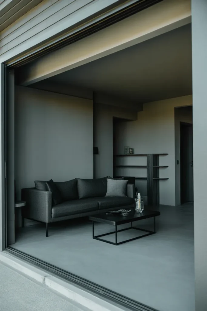
- Enhances sleek, modern look
- Creates visual harmony with limited palette
- Perfect for small or contemporary rooms
- Highlights furniture and textures
- Easy to accessorize with metallic accents
Monochrome minimalist living rooms create a sophisticated, polished environment that feels intentional and contemporary. By limiting the color palette to shades of gray, black, and white, the space gains visual harmony and a sense of order. I’ve noticed that this approach allows textures and shapes to stand out, from soft rugs to geometric furniture forms. Even small living rooms benefit, as the simplicity of a monochrome palette can make the area feel more spacious. Accessories like metallic accents or a single statement art piece can be added without disrupting the cohesive, refined look.
Adopting a monochrome palette works especially well when paired with natural or artificial lighting that enhances contrasts subtly. Designers often recommend using varying shades within the same color family to prevent the room from feeling flat or cold. I’ve seen this style succeed in modern apartments and larger open-concept homes alike, offering flexibility for furniture swaps or seasonal décor. Monochrome minimalism encourages careful selection of each piece, ensuring functionality and aesthetics align. The end result is a striking, elegant living room where simplicity and sophistication coexist seamlessly.
Jewel Tone Elegance
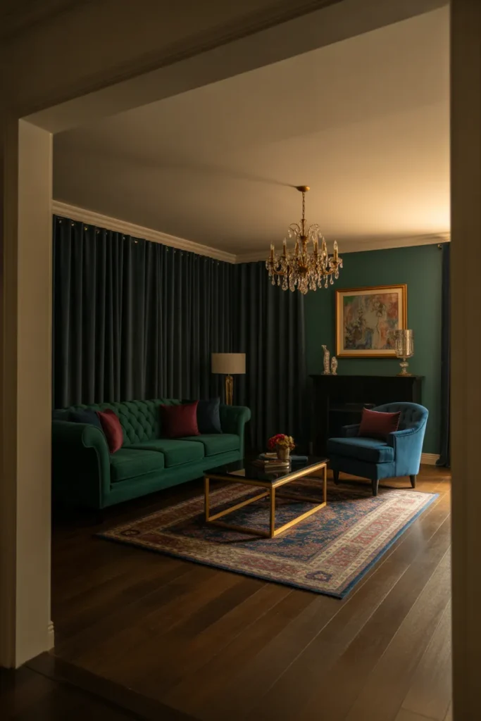
- Adds richness and visual drama
- Works well with metallic accents
- Creates a luxurious, elegant ambiance
- Encourages bold, confident décor choices
- Ideal for sophisticated, statement-making spaces
Jewel tone elegance brings a sense of luxury and sophistication to a living room, transforming it into a visually striking space. Deep emerald, sapphire, or ruby hues create drama while maintaining balance when paired with neutral walls or subtle metallic accents. I’ve noticed that using jewel tones in furniture and accessories allows homeowners to express bold style confidently. These rich colors add depth and dimension, giving the room a curated, intentional feel. Incorporating textures like velvet, silk, or polished wood enhances the luxurious effect, resulting in a space that feels both refined and inviting.
Using jewel tones effectively requires careful balancing to avoid overwhelming the room. Designers often suggest pairing vibrant colors with neutral or muted backgrounds and minimal clutter to maintain elegance. I’ve seen rooms come alive with jewel-toned sofas, chairs, or accent pillows complemented by subtle gold or brass details. This approach works in both traditional and modern layouts, allowing flexibility for seasonal décor updates. Jewel tones naturally draw the eye, creating focal points that feel intentional and high-end. The result is a living room that radiates richness, warmth, and sophisticated charm without sacrificing comfort or livability.
Soft Pastel Harmony
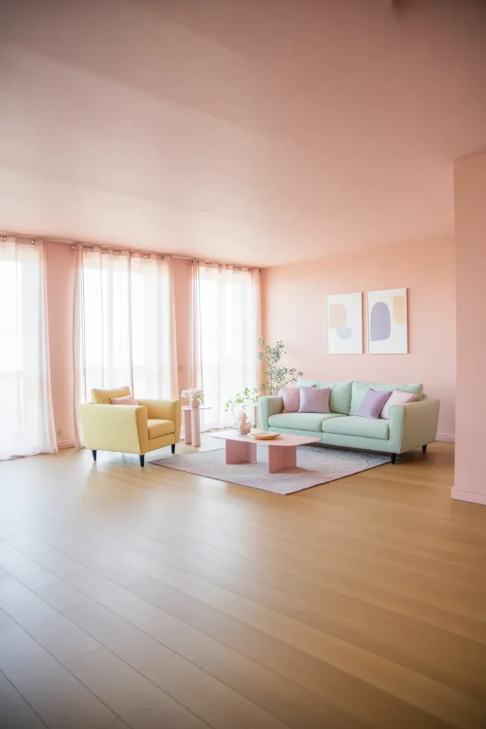
- Creates cheerful, uplifting atmosphere
- Works well in sunlit spaces
- Enhances light and openness visually
- Easy to mix and match pastel shades
- Ideal for a soft, welcoming feel
Soft pastel harmony creates a living room that feels bright, cheerful, and welcoming. By blending gentle shades like pink, mint, lavender, and pale yellow, the space becomes light and airy without feeling cluttered. I’ve noticed that using pastels in furniture, walls, or accessories softens the overall look while maintaining sophistication. This approach allows homeowners to layer colors subtly, introducing contrast through textures or small decorative elements. The result is a visually cohesive environment that encourages relaxation, socializing, and creativity. Pastels work particularly well in rooms with ample sunlight, enhancing brightness and visual appeal.
Layering soft pastel shades helps balance color intensity while preserving harmony. Designers often recommend keeping the majority of surfaces neutral or lightly tinted to allow pastel accents to shine without overpowering. I’ve seen this technique work exceptionally well in modern apartments, cottage-style homes, and open layouts, creating a sense of continuity and calm. Incorporating plants, light wood furniture, and minimalistic décor complements the pastel palette. Soft pastel harmony transforms ordinary living spaces into uplifting, visually engaging rooms where color, light, and texture work together to make every moment in the room feel fresh and inspiring.
Bold Contrast Pops
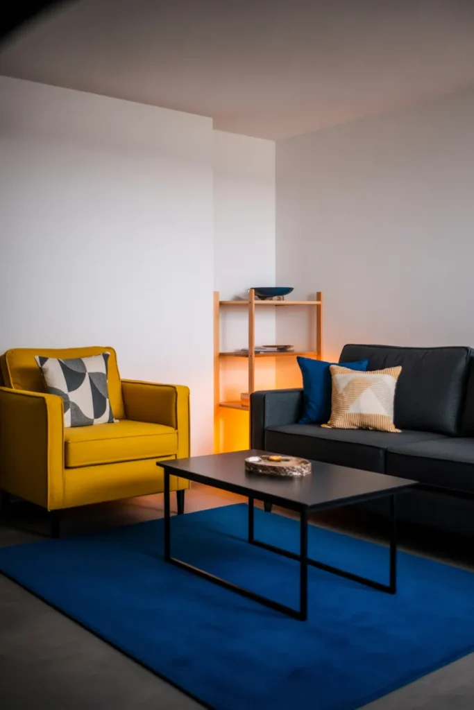
- Creates striking visual interest
- Highlights furniture and décor intentionally
- Works with minimalist or modern spaces
- Encourages playful color experimentation
- Makes the room feel energetic and vibrant
Bold contrast pops are a fun way to energize a living room without overwhelming the space. By pairing neutral foundations like white walls and gray sofas with bright accent colors, the eye is naturally drawn to statement pieces. I’ve noticed that even a single bold chair or vibrant rug can change the perception of an entire room, adding personality and depth. This technique works especially well in modern layouts where clean lines and minimal furniture allow the contrasting elements to shine. Overall, it balances excitement with intentional design for a lively, stylish space.
Using bold contrast effectively requires careful selection of colors and placement. Designers often recommend choosing two or three standout shades to avoid visual chaos. I’ve seen living rooms transform dramatically when pops of color are strategically placed, such as a bright armchair, patterned throw, or statement art. Neutral walls and subtle textures anchor the palette while vibrant accents provide energy. This method allows for seasonal updates through small accessories while maintaining cohesion. Bold contrast pops not only enhance visual interest but also create focal points, making a room feel dynamic, intentional, and full of personality without sacrificing sophistication.
Natural Wood Accents
- Brings warmth and organic texture
- Enhances a neutral or soft palette
- Works with minimal and modern décor
- Encourages cozy, inviting feel
- Complements greenery and natural light
Natural wood accents add warmth, texture, and a grounded feeling to living rooms, creating spaces that feel both stylish and welcoming. By integrating wooden furniture, shelving, or flooring, the room gains organic depth and a sense of continuity with the environment. I’ve noticed that pairing natural wood with soft neutral fabrics or muted colors enhances visual balance, making the space feel calm yet inviting. This approach works in both minimalist and eclectic interiors, giving designers flexibility. Wood accents also age beautifully over time, maintaining character while remaining timeless, functional, and aesthetically pleasing for daily living.
Using natural wood strategically strengthens a room’s personality without overwhelming the color scheme. Designers often suggest mixing light and dark wood finishes to introduce subtle contrast and dimension. I’ve seen this technique create harmonious layouts where furniture, décor, and structural elements feel connected and intentional. Adding woven baskets, wooden frames, and greenery further reinforces organic texture and warmth. Rooms with natural wood accents feel comforting, grounded, and visually appealing, making them ideal for both quiet relaxation and social gatherings. The tactile quality of wood also contributes to a multi-sensory experience that enhances overall room ambiance.
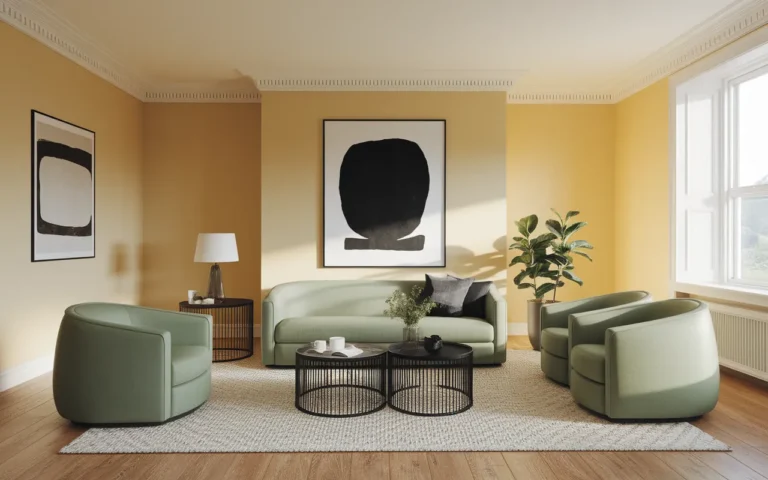
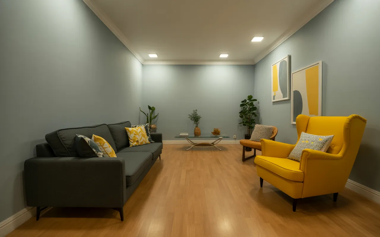
Grey and Yellow Blend
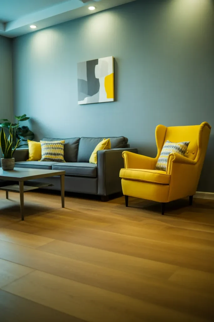
- Balances calm neutrals with energetic accents
- Creates cheerful, contemporary ambiance
- Works well in small or open layouts
- Easy to update with accessories
- Enhances visual flow and harmony
A grey and yellow blend is an effective way to bring energy to a living room while maintaining sophistication. The neutral gray foundation provides calm and balance, while yellow accents add vibrancy and warmth. I’ve noticed that this combination works well across various layouts, from compact apartments to expansive spaces. Adding yellow through pillows, chairs, or artwork ensures that the room feels lively without overwhelming the senses. This approach highlights the importance of thoughtful color placement, resulting in a visually harmonious, inviting, and cheerful living area that feels both fresh and modern.
Integrating grey and yellow requires careful attention to proportion and placement. Designers often recommend keeping larger surfaces neutral and reserving the yellow for accent pieces that draw the eye. I’ve seen living rooms transformed with this pairing, where the color contrast elevates the design while retaining flexibility for future décor changes. Complementary textures like rugs, throws, and cushions enhance the overall palette. The combination also works beautifully with natural light, enhancing brightness and warmth. Grey and yellow together create a balanced, stylish living room that feels uplifting, contemporary, and visually engaging without sacrificing comfort or versatility.
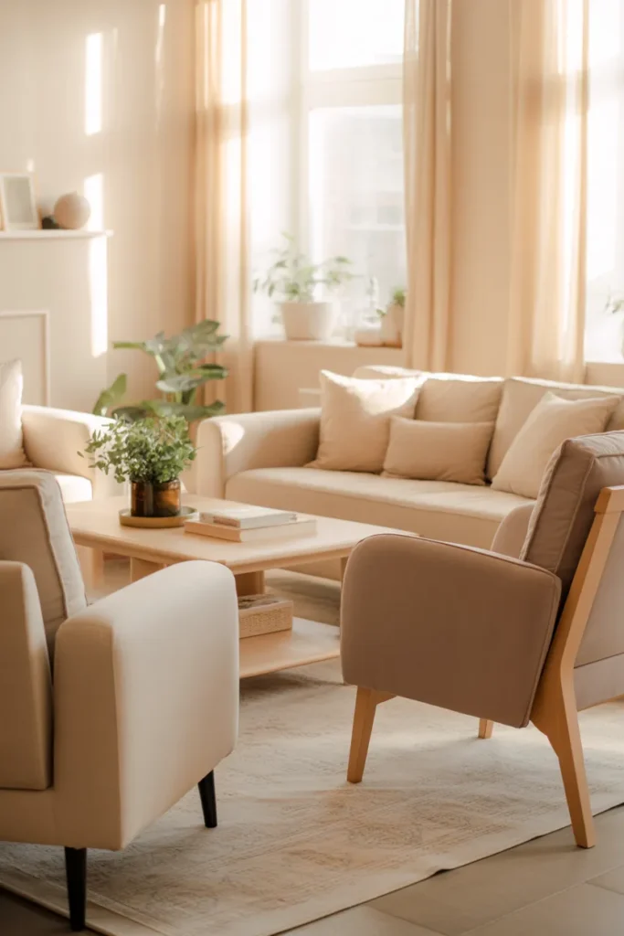
Blush and Cream
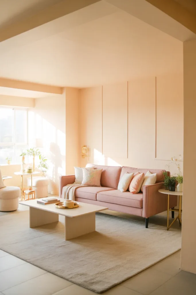
- Creates soft, inviting warmth
- Adds a gentle romantic touch
- Works well with natural light
- Easy to pair with metallic or wooden accents
- Ideal for cozy yet chic living spaces
Blush and cream color combinations offer a soft, airy aesthetic that makes a living room feel warm and inviting. The subtle pink tones in furniture or décor paired with creamy neutral walls create a gentle contrast, perfect for both casual and elegant settings. I’ve noticed that layering textures, such as velvet cushions, wool rugs, or linen curtains, enhances the tactile appeal and prevents the space from feeling flat. This palette allows homeowners to update accent colors seasonally, maintaining freshness while keeping a cohesive, soft, and visually appealing living area that feels curated and approachable.
Using blush and cream together emphasizes light, warmth, and comfort without overpowering the senses. Designers often suggest incorporating small metallic or wooden elements to break monotony and add depth. I’ve seen this approach transform ordinary spaces into serene, stylish rooms where color, texture, and natural light work together harmoniously. The combination is especially effective in rooms with ample sunlight, as it enhances brightness and softness. Blush and cream balance romance and sophistication, creating a living room that feels effortlessly elegant, cozy, and visually fresh while remaining adaptable to various furniture styles and décor updates.
Olive and Tan Mix
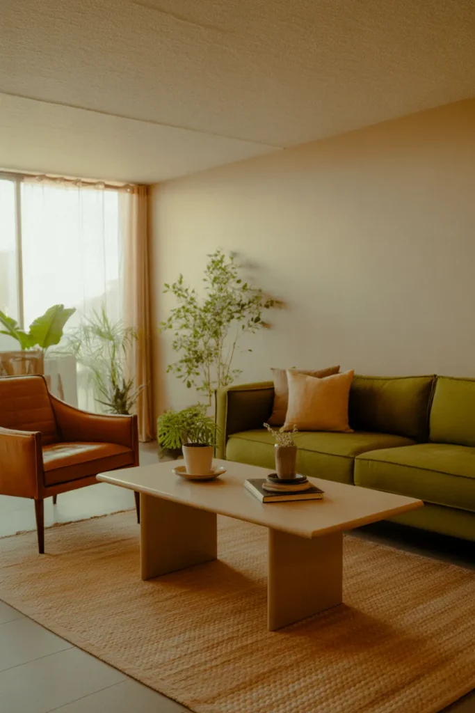
- Balances warmth with natural sophistication
- Works with modern and mid-century layouts
- Adds depth and earthy appeal
- Complements greenery and wood elements
- Versatile for accent colors or textures
An olive and tan color scheme provides an earthy, balanced aesthetic that works beautifully in living rooms. Olive furniture or accent pieces create a rich, grounded feel, while tan and beige tones soften the palette, ensuring it remains light and approachable. I’ve noticed that pairing these shades with natural wood and greenery enhances warmth and visual interest, making the space feel both comfortable and curated. This combination is versatile, easily adaptable to various décor styles, and allows homeowners to refresh accent colors or accessories without disrupting the cohesive, inviting, and naturally sophisticated vibe of the room.
Using olive and tan together creates harmony through complementary earthy shades that feel both modern and timeless. Designers often recommend layering textures, like leather, linen, or woven rugs, to enhance depth and prevent monotony. I’ve seen small touches of gold or bronze accessories elevate this palette, adding sophistication without detracting from the natural appeal. This color scheme also works well with sunlight and indoor plants, creating a balanced, grounded, and visually appealing space. Olive and tan living rooms feel welcoming, stylish, and flexible for seasonal updates or evolving furniture arrangements.
Also view : 24 Cottage Living Room Ideas Full of Cozy Charm
Soft Gray Serenity
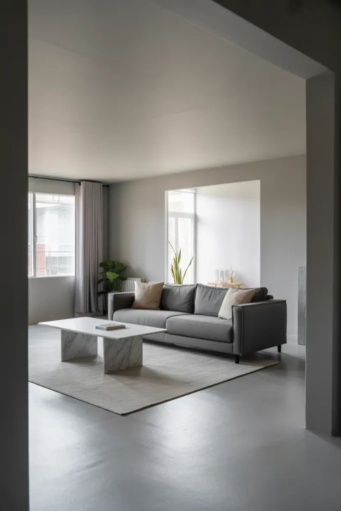
- Creates calm, balanced atmosphere
- Works with various accent colors
- Enhances natural light and spacious feel
- Ideal for modern or minimalist layouts
- Provides versatile backdrop for décor updates
Soft gray serenity offers a calming and sophisticated approach to living room design. Light gray walls and furniture create a neutral, cohesive foundation that can support various accent colors or textures. I’ve noticed that layering shades of gray with white, metallic, or wooden elements enhances depth and visual interest without overwhelming the space. This palette works particularly well in rooms with ample sunlight, as natural light interacts beautifully with gray tones, creating an airy and serene feel. Soft gray living rooms provide flexibility for both modern and minimalist interiors while maintaining timeless appeal.
Incorporating soft gray tones effectively requires balancing shades and textures to avoid a flat appearance. Designers often suggest combining fabric variations, patterned rugs, and subtle decorative elements to introduce dimension. I’ve seen rooms feel both tranquil and stylish when this technique is applied, making gray the perfect neutral base for seasonal updates or statement accent pieces. Soft gray serenity allows homeowners to mix colors and textures without clashing, creating a visually harmonious living room that feels spacious, elegant, and restful. This palette adapts seamlessly to evolving design trends and personal preferences.
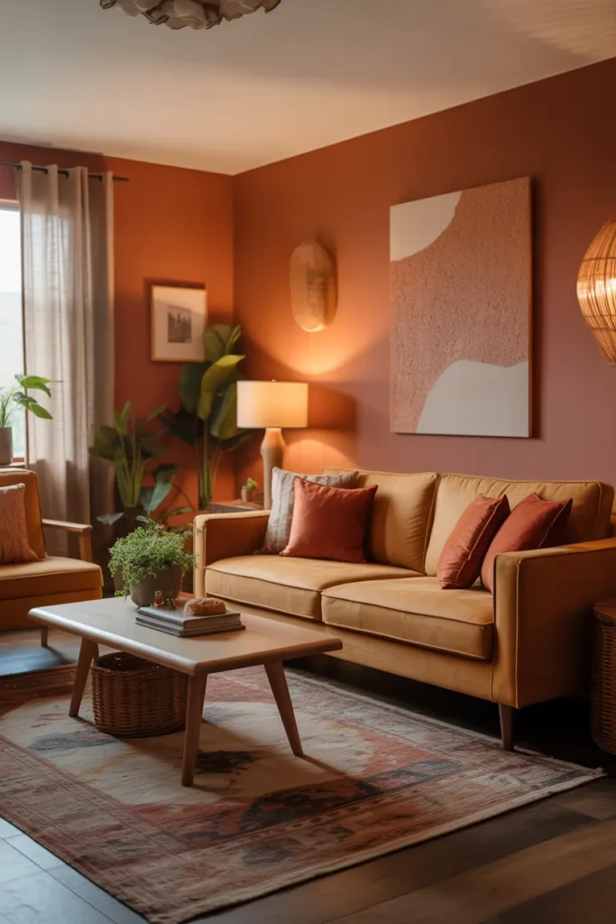
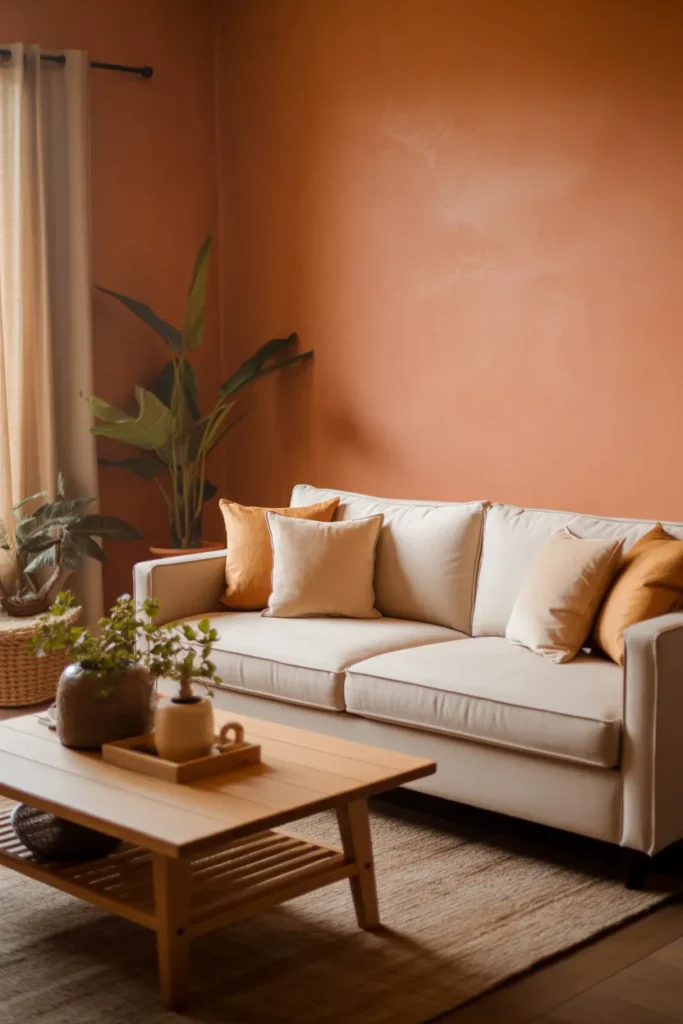
Terracotta Warmth
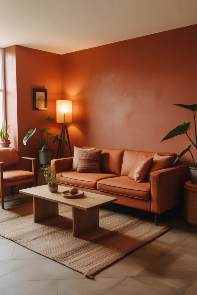
- Adds warmth and comfort to the room
- Highlights natural, earthy tones
- Complements wood and greenery accents
- Perfect for cozy and intimate spaces
- Creates a grounded, inviting atmosphere
Terracotta warmth is a color scheme that transforms living rooms into cozy, inviting spaces. The rich, earthy tones of terracotta walls or furniture instantly add depth and a grounded feeling. I’ve noticed that pairing these shades with natural wood elements and textured accessories, such as woven rugs or linen throws, enhances the tactile and visual appeal. This palette works exceptionally well for rooms intended for relaxation and socializing, as it feels both welcoming and stylish. Terracotta shades also complement greenery, creating a natural, balanced environment that feels intentional and harmonious.
Using terracotta in living rooms is highly effective for introducing warmth and character without overpowering the space. Designers often recommend layering lighter neutrals and natural textures to prevent the palette from feeling too heavy. I’ve seen this approach create harmonious, inviting rooms where furniture, textiles, and décor feel interconnected. Warm lighting further accentuates the richness of terracotta tones, enhancing comfort and ambiance. Terracotta warmth allows flexibility for accent colors like muted greens, soft yellows, or metallic details, providing a visually engaging, cozy, and stylish living room that adapts to both modern and traditional layouts.
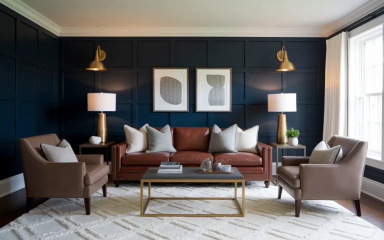
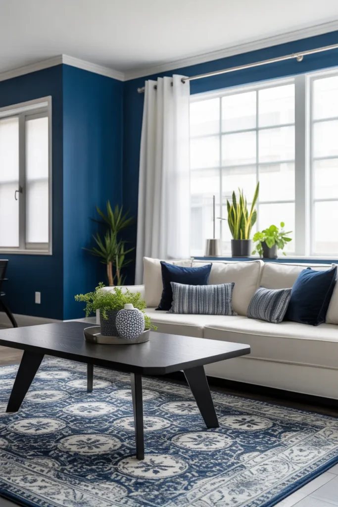
Navy and White Contrast
- Creates crisp, striking visual contrast
- Works well in modern or coastal layouts
- Enhances depth and structure in the room
- Easy to refresh with accent accessories
- Provides a timeless, versatile look
Navy and white contrast is a bold yet timeless approach to living room design. Deep navy walls or furniture pieces paired with crisp white accents create strong visual definition and a sense of structure. I’ve noticed that adding patterns or textures, like a geometric rug or striped pillows, amplifies interest without overwhelming the room. This combination works in both modern and coastal-inspired interiors, providing a versatile canvas for accent pieces. The balance between dark and light tones ensures the room feels dynamic, elegant, and visually engaging while remaining functional and welcoming.
Effectively integrating navy and white requires attention to proportion and layout. Designers often suggest using white for larger surfaces or key furniture items to keep the space bright, with navy for accent walls or statement furniture. I’ve seen rooms transformed when this palette is combined with natural light, plants, and metallic details, creating depth and sophistication. The contrast enhances architectural features and furniture lines, giving the room a polished and intentional feel. Navy and white living rooms feel both classic and modern, making them adaptable to seasonal décor changes and a variety of personal styles while maintaining visual impact.
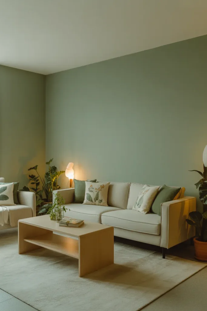
Muted Green Calm
- Creates calm and balanced atmosphere
- Connects interior with natural elements
- Works well with wood and neutral accents
- Encourages relaxation and comfort
- Versatile for modern and classic layouts
Muted green calm is a living room palette that brings nature indoors while maintaining sophistication. Soft sage or olive hues on walls or furniture create a soothing backdrop that promotes relaxation and comfort. I’ve noticed that pairing muted greens with neutral tones, light wood, and subtle textures enhances visual balance and warmth. This color scheme works particularly well in spaces designed for reading, conversation, or quiet reflection, as it encourages tranquility without feeling dull. Layered textures and plants further reinforce the calming, nature-inspired aesthetic, making the room feel inviting and well-curated.
Using muted green tones effectively requires harmonizing with complementary neutral or wooden accents. Designers often suggest incorporating soft textiles, natural materials, and minimal décor to avoid visual clutter while emphasizing serenity. I’ve seen living rooms transformed when muted greens are combined with cream sofas, textured rugs, and indoor plants, creating a balanced, harmonious space. The palette adapts seamlessly to various furniture styles and seasonal accessories. Muted green calm fosters a sense of tranquility, warmth, and elegance, making the living room a relaxing retreat that feels visually cohesive, refreshed, and grounded.
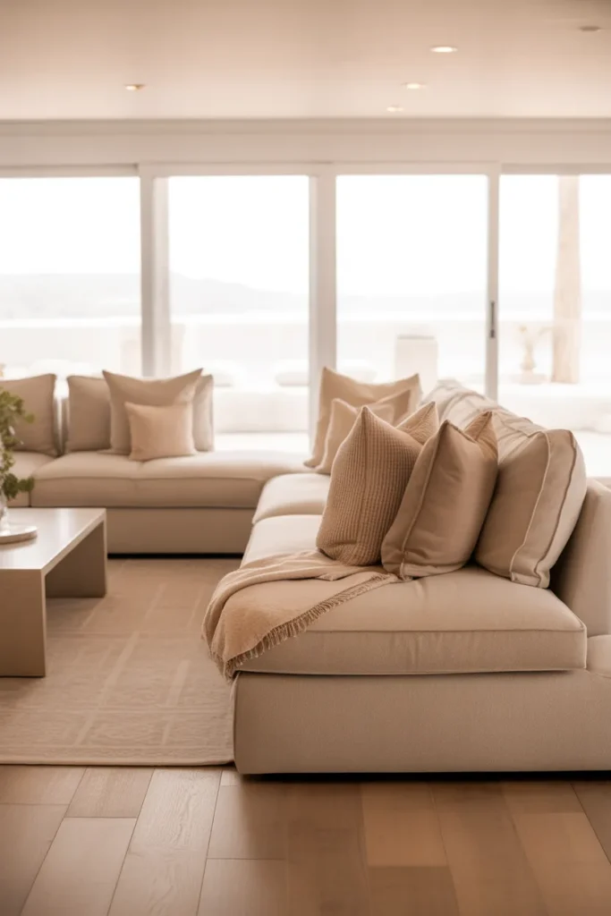
Soft Beige Layers
- Enhances warmth and cohesion
- Creates a flexible neutral base
- Works well with natural light
- Allows easy addition of accent colors
- Promotes calm, inviting ambiance
Soft beige layers are a simple yet effective way to create an inviting, flexible living room. By layering subtle shades of beige across walls, furniture, and accessories, the space feels cohesive and warm without being monotonous. I’ve noticed that using texture variations—like linen cushions, wool rugs, or woven baskets—adds depth and prevents flatness. This approach works in both small and large rooms, offering a neutral backdrop that allows accent colors or seasonal décor to shine. The result is a serene, elegant living space that feels polished yet comfortable.
Using soft beige tones strategically provides a calming and timeless aesthetic. Designers often recommend incorporating multiple textures and finishes, such as wood, fabric, and metal, to enrich the neutral palette. I’ve seen rooms come alive when beige layers are complemented by greenery or subtle metallic accents, balancing warmth and sophistication. Soft beige layers also make natural light feel more pronounced, enhancing the sense of space and openness. This technique allows homeowners to maintain a flexible, adaptable living room that can easily evolve with changing décor trends while remaining cozy, visually appealing, and harmonious.
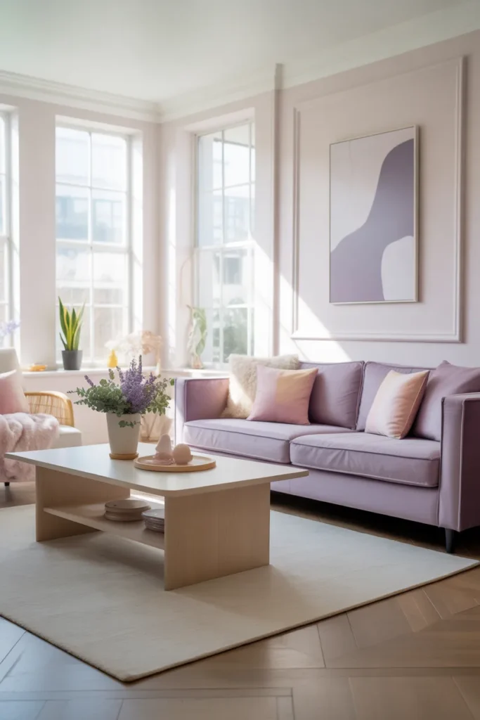
Lavender Accents
- Adds subtle color and personality
- Creates calm, refreshing ambiance
- Works well with soft neutrals
- Highlights furniture and textiles
- Ideal for chic, modern interiors
Lavender accents offer a subtle way to introduce color without overwhelming the living room. A lavender sofa, cushions, or décor pieces provide a calm and refreshing ambiance that balances elegance and comfort. I’ve noticed that pairing lavender with soft neutrals like cream, beige, or light gray enhances the sophisticated, airy feel of the space. This approach works well in modern, minimalist, or transitional interiors, offering visual interest while remaining gentle and approachable. The result is a chic, serene environment that feels inviting and thoughtfully styled.
Incorporating lavender effectively requires careful balance with complementary neutral tones. Designers often suggest keeping larger surfaces muted while introducing lavender through accent furniture, throws, or decorative elements. I’ve seen rooms transformed by subtle pastel touches, creating focal points that feel intentional and visually appealing. Combining lavender with natural textures, light wood, or greenery adds depth and warmth, enhancing comfort. This palette is versatile for seasonal updates, allowing the space to remain dynamic and stylish. Lavender accents result in a living room that feels soft, welcoming, and elegant without sacrificing balance or cohesion.
Terracotta and Cream Combo
- Brings warmth and balance to the room
- Combines earthy and soft neutral tones
- Enhances cozy and inviting feel
- Works well with natural wood and textures
- Ideal for relaxing and stylish interiors
Terracotta and cream combination creates a warm, inviting living room that feels grounded and cozy. The earthy terracotta tones bring depth and richness, while cream accents soften the palette and add lightness. I’ve noticed that pairing these colors with natural wood furniture and textured accessories, such as woven rugs or cushions, enhances visual interest and tactile appeal. This approach works well in rooms designed for relaxation or entertaining, providing a balanced backdrop that is both stylish and functional. Terracotta and cream together create a harmonious, timeless aesthetic.
Effectively using terracotta and cream requires layering textures and careful proportioning of colors. Designers often recommend keeping larger surfaces neutral while emphasizing terracotta in accent walls, sofas, or decorative pieces to avoid visual heaviness. I’ve seen rooms come alive when greenery, natural materials, and soft lighting complement the earthy tones, creating a balanced, inviting atmosphere. This combination allows for seasonal décor changes while maintaining cohesion and warmth. Terracotta and cream living rooms feel comfortable, elegant, and approachable, providing a stylish foundation that adapts well to various furniture styles and personal design preferences.
Charcoal and Oak
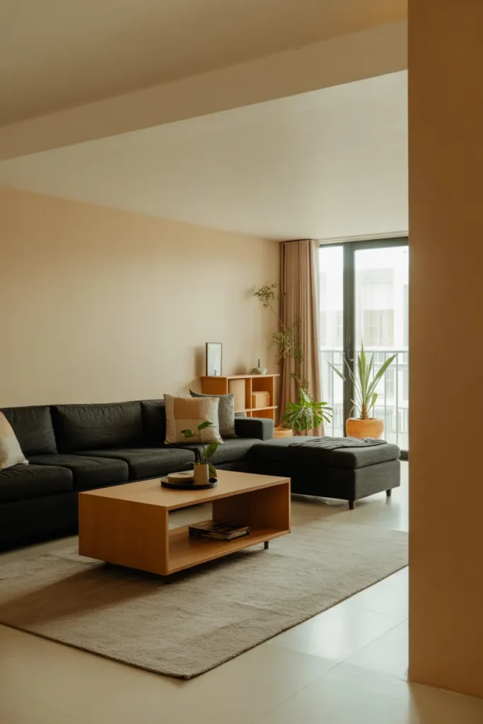
Creates striking yet cozy contrast
Works well in modern or Scandinavian interiors
Highlights natural wood textures
Adds depth and visual structure
Flexible for accent colors and décor updates
Charcoal and oak is a versatile combination that balances boldness and warmth in living rooms. Dark charcoal furniture contrasts beautifully with light oak surfaces, creating visual depth while maintaining a welcoming feel. I’ve noticed that layering textures, such as soft rugs, cushions, and wooden décor, enhances the tactile appeal and prevents the space from feeling cold or heavy. This palette works well in modern, Scandinavian, or minimalist interiors, offering flexibility for accent colors, artwork, and seasonal accessories. Charcoal and oak together produce a contemporary yet cozy aesthetic that is both stylish and functional.
Effectively using charcoal and oak requires careful attention to proportion and lighting. Designers often suggest using darker tones for furniture or feature walls while letting oak and neutrals brighten the space. I’ve seen living rooms transformed when this pairing is complemented with greenery, metallic accents, or textured fabrics, creating a balanced and visually engaging environment. The combination allows homeowners to introduce seasonal or bold accent colors without clashing, maintaining cohesion. Charcoal and oak living rooms feel modern, grounded, and inviting, providing a dynamic backdrop that is timeless, adaptable, and comfortable for everyday living.
Cream and Teal Mix
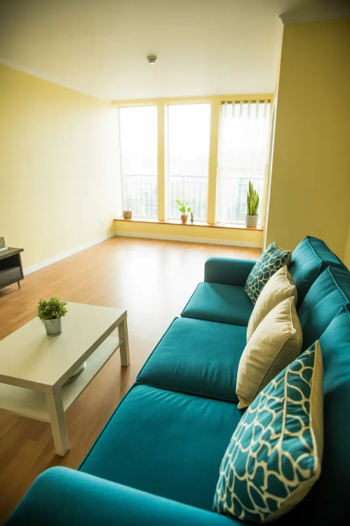
- Adds freshness and energy
- Balances neutrals with a rich accent
- Works well in sunlit spaces
- Easy to accessorize with soft textures
- Creates a visually uplifting environment
Cream and teal creates a fresh, vibrant living room that feels both energetic and balanced. The neutral cream foundation allows teal furniture or accents to pop without overwhelming the space. I’ve noticed that pairing this combination with natural light and soft textures, like plush cushions or area rugs, enhances comfort and visual appeal. This approach works well in modern, coastal, or transitional interiors, providing a lively yet sophisticated atmosphere. Cream and teal together produce a cheerful, inviting aesthetic that encourages relaxation and socializing while remaining visually harmonious.
Using cream and teal effectively involves balancing bold and neutral tones carefully. Designers often recommend limiting teal to key furniture pieces or accent décor to maintain cohesion. I’ve seen this palette transform sunlit living rooms into vibrant yet calming spaces where color, light, and texture work together seamlessly. Complementary natural wood or metallic elements can elevate the look while preserving harmony. Cream and teal living rooms feel airy, refreshing, and welcoming, offering versatility for seasonal décor updates or personal style tweaks. The combination balances warmth, energy, and sophistication for a visually engaging environment.
Soft Blush and Gray
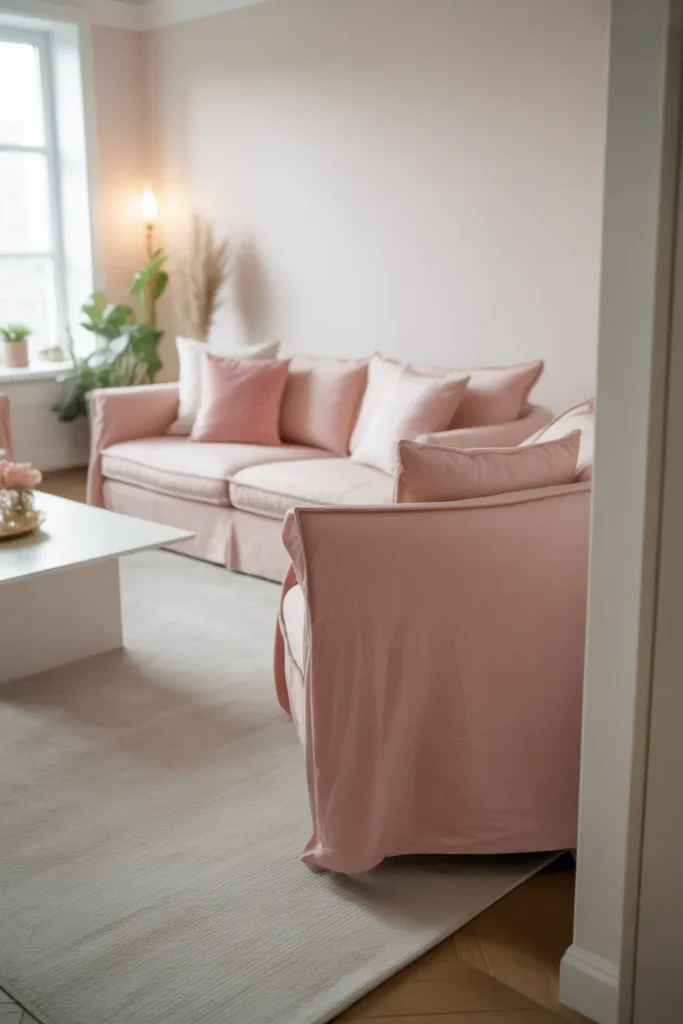
- Adds gentle warmth and charm
- Creates calm, elegant ambiance
- Works well with pastel or neutral accents
- Enhances texture layering and comfort
- Ideal for cozy yet sophisticated interiors
Soft blush and gray is a delicate, elegant color scheme that gives living rooms warmth without overwhelming the senses. Blush furniture or accessories paired with gray walls and neutral accents create a soft, harmonious balance. I’ve noticed that incorporating layered textures, such as rugs, throws, and cushions, enhances both visual and tactile interest. This palette works particularly well in sunlit rooms, as natural light emphasizes the softness and subtle contrast. Soft blush and gray living rooms feel stylish, inviting, and cozy while maintaining a refined, contemporary look suitable for everyday living.
Using soft blush and gray together allows for a refined and versatile interior that balances warmth and neutrality. Designers often suggest accenting the palette with subtle metallics, wood, or indoor plants to add dimension and interest. I’ve seen living rooms become serene, chic, and visually layered when blush elements are strategically placed on sofas, cushions, or décor pieces. The combination also adapts well to seasonal accessories and evolving furniture choices, keeping the space fresh and dynamic. Soft blush and gray creates a living room that feels both romantic and practical, stylish yet approachable for daily life.
Conclusion :
With these 21 living room color schemes, you have a palette of ideas to transform your space into a fresh, stylish haven. From subtle neutrals to bold statement colors, each combination offers practical ways to enhance comfort, light, and personality. I’ve seen how small adjustments like layering textures or adding accent pieces can completely change the mood of a room. Save this post on Pinterest, experiment with a few ideas in your own home, and share it with friends who love home décor. Your living room can feel vibrant, inviting, and truly reflective of your style.